“I’m interested in stretching what you can do with data and coming up with ideas of representing it that people haven’t thought of before. I think there’s a whole spectrum of possibilities here.”
– Miriam Quick
Miriam Quick, an accomplished journalist, author, and musician renowned for her innovative approach to data communication, underscores the importance of visualizations and unconventional methods in data journalism. Her work explores beyond the conventional to make data more engaging, breaking the stereotype that data is dull or mundane.
In her conversation with host Chris Richardson, Miriam reflects on her unique journey into the data world, combining her passion and strengths with her expertise in computer science to craft a distinctive narrative. She delves into the art of making data accessible and engaging, especially for a broader audience, emphasizing the value of a beginner’s mindset when exploring interesting aspects within datasets.
So how do you take a creative leap with data?
- Develop narratives mindful of the presentation format (infographic, dashboard, animation), audience, and tone
- Use spreadsheets as a starting point to structure information and create visual formats
- Engage with interactive elements like charts and games to tell a compelling data story
- Focus on accuracy and value judgments, regardless of the project’s creative or conventional nature
- Draw inspiration from various sources like Information is Beautiful Awards Showcase and unconventional chart types from repositories like Xenographics
Miriam also discusses her book, “I Am a Book. I Am a Portal to the Universe,” a love letter to book design shared through fascinating data measurements. This conversation ultimately aims to inspire listeners to rethink how they visualize data, striving for creativity and impact in their presentations to overcome the prevalence of poorly designed ones. Click here to learn more about Miriam.
Do not miss this riveting conversation—hit play now to uncover insights that will reshape your perspective on data visualization.
Want to dive deeper into this topic? Check out the resources below for insights on how to use data visualizations to communicate critical insights.
- Article | Maximizing the Impact of Your Data with Compelling Data Visualizations
- Article | How to Avoid Bad Data Visualizations
- Article | Data Visualization Best Practices
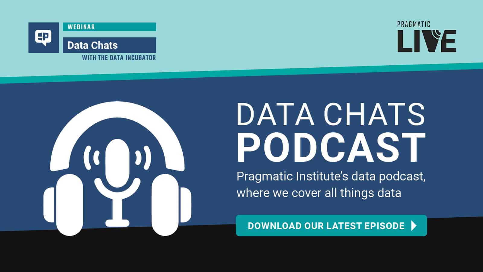
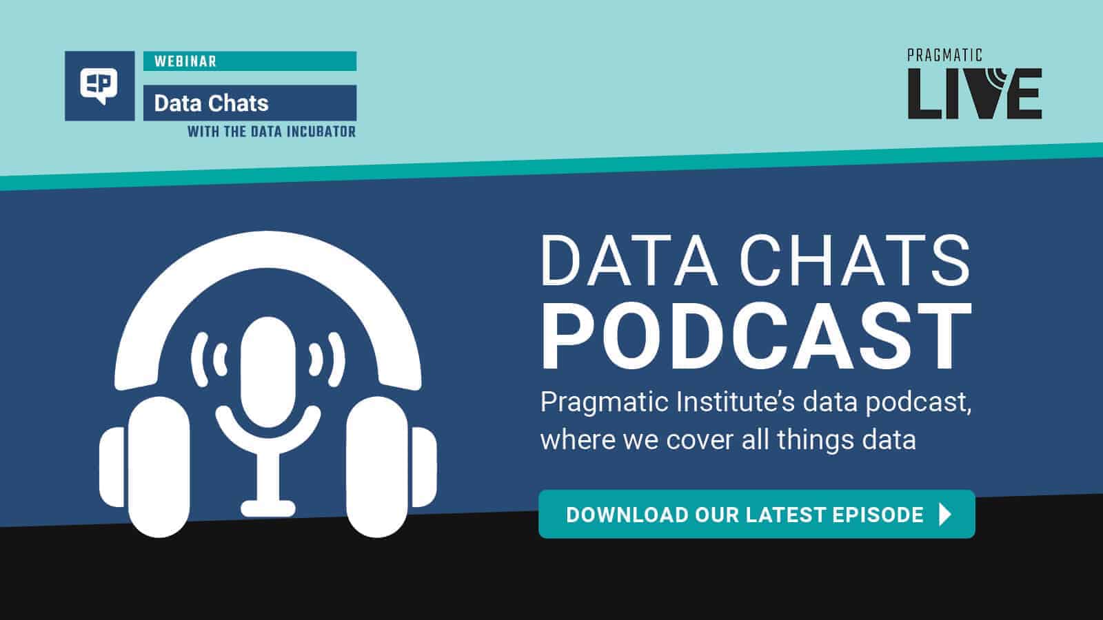
- Podcast | Tell Your Data Story
- Podcast | Put Down the Pie Chart and Other Data Visualization Strategies
- Podcast | Data Visualization and How to Stop Your Charts From Lying
Learn to Deliver Better Data Insights I Business-Driven Data Analysis
This course is designed to help you translate a business problem into data analysis that provides actionable insights. Transform how you present insights and advance from a tactical role to being a strategic contributor for your organization.
✔ Translate business needs into achievable data projects
✔ Learn a proven and repeatable approach to data analysis
✔ Identify the fastest path to actionable insights
✔ Communicate effectively with diverse stakeholders